- a modern approach to a CD cover.
- allows for inclusion of more information about the band / artist.
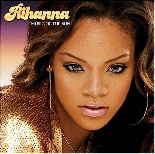
The function of a digipak is to first and foremost promote the artist. Also it gives the audience an insight as to what type of person the artist is and what they would like perhaps portray as an artist. The novelty / collection aspect of a digipak makes the audience want to buy them more as you feel you are getting more for your money. Digipaks can show the growth of the artist through their career, as artists can change their looks for particular albums to suit the type of music they are producing at the time. An example of this is Rihanna, these are her first, fourth and fifth albums which all look completely different.


Digipaks are mainly used as the novelty, because as a fan you may want a physical copy of the album and may collect these. The good artwork shown on digipaks sells and also it makes the album stand out when on a shelf at a music store, therefore it helps to attract new audiences, who may not have initially listened to that type of artist. Artists like Mika use consistantly bright album covers.

The importance of digipaks is that artists can base success on CD sales, as there is charts for these, even though there is a massive emergence of online downloading. Also the digipaks help to make money for the artist and record company and perhaps even try and minimize illegal downloading. This is because with digipaks they try to appeal to our love of music and the artist, it presents the idea that you are not a real fan of a particular artist if you don't buy their CD.
WHAT DOES A DIGIPAK LOOK LIKE?
 |
| This is a conventional 6-panel digipak. |
- Digipaks use very simple colour schemes of only three colours
- The right panel (front) shows the Artist's name in a larger font that the album name.
- There is usually a picture of the artist if it is a debut album, but in this case Oasis already have a large fan base and this album is just for their acoustic material.
- Sometimes there can be a promotional sticker if it is an exclusive.
- On the left panel (back). there is always a track list and production information that includes, copyright, web addresses and the distributor,
- There is a barcode and record label logos.
- The price is not displayed as it can vary in different shops.
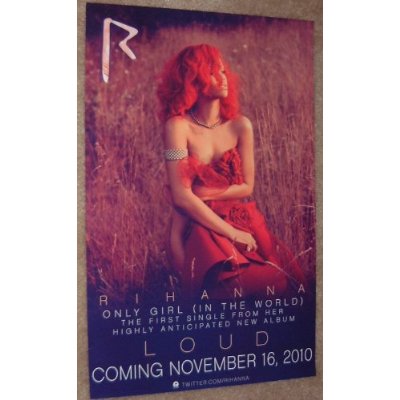
WHAT DOES THE ADVERTISEMENT LOOK LIKE?
Advertisements are like posters which support the digipak to help promote the artist. I'm using Rihanna again as an example.
 |
| 1 |
 |
| 2 |
Both of these adverts are effective because they split the page into three. 2/3 consists of a picture of the artist as a prominent display, which is good because promoting the artist is most important. These adverts are both very simple but tell the audience what they need to know.
Number 1: This advertisement is good because it shows logos of the record labels. However it is for a single and not an album. It is still good because the song is written at the top in a plain font followed by the artist's name.
Number 2: This is an advert for her new album Loud. This has the conventions of a good advertisement because it shows the release date and features one of her hit songs from the album to attract the audience. Rihanna is already a brand, so for the image they have used a picture of Rihanna which is similiar to that of the digipak and it is easily recognisable. Also there is the use of the trademark 'R' sign in the top corner.
Adverts can also contain tour dates, quotes or reviews. However one is only chosen because it can make the advertisement look too much and overcrowded
Adverts can also contain tour dates, quotes or reviews. However one is only chosen because it can make the advertisement look too much and overcrowded
No comments:
Post a Comment