
Having looked at good and bad examples in class I have chosen what is to be my favourite example of a digipak and an advertisement. it is evident that the person who did it genuinely put time and effort into their work. First I will start with analysing of the advertisement. The font that has been used, looks handwritten giving the advertisement a feel of the artists personal touch. We have been advised not to use there fonts because it can be risky but this particular person managed to pull it off well in my opinion. It looks very professional. You have the artist title and album which is the main information that you need on a poster, an interesting image has been used to attract attention. Also the rating (starts) have been used effectively and the font had been changed to suit the general poster style it flows beautifully. Which brings me onto my next point, the digipak. It's clear that the person took a lot of interest and took a long time to match the advertisement with the digipak. The same text has been used in both creating less of a contrast giving it a flowing feel.


Also I like how they used the same image on the front cover as on the advertisement this saves them the trouble of feeling like they have to include an image of the cd, which makes the entire thing look much classier. The front cover is beautiful and the best thing about is that it is very simplistic. There is nothing missing on the front cover and it's evident they've thought about it in detail (they even remembered to put information on the spine). The back is very good. I love how the black background goes onto the back of the cover and a simple white writing has been used to accentuate the titles of the songs. The entire thing looks very professional and just flows. The inside of the digipak is also exceptional. It looks 'magical' which blends in with the entire theme of what is clearly 'Alice in Wonderland'. It is very simple only consists of where the CD would actually go and doesn't have useless information on the inside (like thankyous').

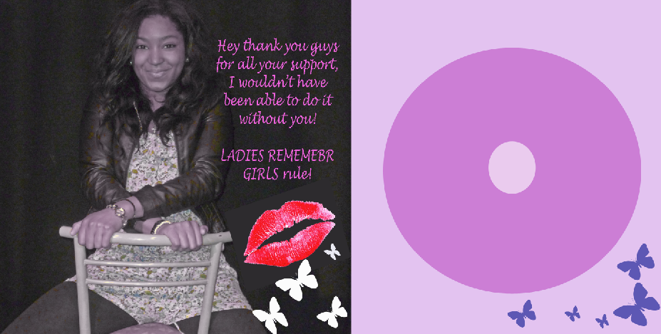
This is a clear example of bad advertisement. For a start there has been no real effort put into it. The background colour is plain pink, this is highly ineffective and the creator forgot to colour the top left hand corner, I know that the previous example that I used as a good one also doesn't have particularly interesting graphics but it looks very stylish because of the way that it has been constructed. The image choice for this one is also very disappointing, the lighting on her face doesn't look at all interesting, and there is a massive difference between her picture in the advertisement and the CD cover (which has also been stretched so it doesn't look very flattering). The text chosen looks anything but professional and graphics like the music notes and butterflies also look very cheap. I genuinely cannot understand why they didn't chose to fill up the screen with the shot of the girl and left a massive blanc space at the bottom with three logos - one being on her foot.


For me personally the front or back cover doesn't do very much. The way that the text has been laid out on the front looks bizzare and then image does not blend with the pink background. Not only that the back clashes with the front, I can't understanding with such a sweet pink and 'sweet revenge' what traffic lights have to do with it. I suppose if you dig deep enough and discover that they mean 'ready, set, go..' maybe? Oh who knows. (Which is precisely the problem). The inside of the digipak doesn't provide much change although I do like how they carried on the same theme they had going on on the outside (one panel being light and the other dark) inside of the digipak. Looking at the two of these I can genuinely say thank you to my teachers for showing me exactly what to NOT go for. I guess the moral of the story is be creative, but the simpler the better.


 For me personally the front or back cover doesn't do very much. The way that the text has been laid out on the front looks bizzare and then image does not blend with the pink background. Not only that the back clashes with the front, I can't understanding with such a sweet pink and 'sweet revenge' what traffic lights have to do with it. I suppose if you dig deep enough and discover that they mean 'ready, set, go..' maybe? Oh who knows. (Which is precisely the problem). The inside of the digipak doesn't provide much change although I do like how they carried on the same theme they had going on on the outside (one panel being light and the other dark) inside of the digipak. Looking at the two of these I can genuinely say thank you to my teachers for showing me exactly what to NOT go for. I guess the moral of the story is be creative, but the simpler the better.
No comments:
Post a Comment