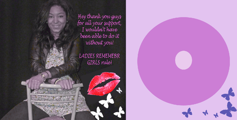
we decided to take our own pictures and experiment using photoshop to make a digipak, this is my practice, i think its very original.
Thursday, 1 December 2011
digipak practice
we decided to take our own pictures and experiment using photoshop to make a digipak, this is my practice, i think its very original.
Practise with photoshop.. FAIL.
This was my first attempt at ever using photoshop and I think I need to brush up on my skills personally! I found it so difficult to use. Theres too many tools and everytime I clicked on one I did something wrong. Poor Mickey had to deal with my 101 continuous questions over and over.. I think until I get the hang of it I'll be fine but for now I better start practising!
Research for Ancillary Products...Student Example Analysis
Having looked at good and bad examples in class I have chosen what is to be my favourite example of a digipak and an advertisement. it is evident that the person who did it genuinely put time and effort into their work. First I will start with analysing of the advertisement. The font that has been used, looks handwritten giving the advertisement a feel of the artists personal touch. We have been advised not to use there fonts because it can be risky but this particular person managed to pull it off well in my opinion. It looks very professional. You have the artist title and album which is the main information that you need on a poster, an interesting image has been used to attract attention. Also the rating (starts) have been used effectively and the font had been changed to suit the general poster style it flows beautifully. Which brings me onto my next point, the digipak. It's clear that the person took a lot of interest and took a long time to match the advertisement with the digipak. The same text has been used in both creating less of a contrast giving it a flowing feel.
Also I like how they used the same image on the front cover as on the advertisement this saves them the trouble of feeling like they have to include an image of the cd, which makes the entire thing look much classier. The front cover is beautiful and the best thing about is that it is very simplistic. There is nothing missing on the front cover and it's evident they've thought about it in detail (they even remembered to put information on the spine). The back is very good. I love how the black background goes onto the back of the cover and a simple white writing has been used to accentuate the titles of the songs. The entire thing looks very professional and just flows. The inside of the digipak is also exceptional. It looks 'magical' which blends in with the entire theme of what is clearly 'Alice in Wonderland'. It is very simple only consists of where the CD would actually go and doesn't have useless information on the inside (like thankyous').
This is a clear example of bad advertisement. For a start there has been no real effort put into it. The background colour is plain pink, this is highly ineffective and the creator forgot to colour the top left hand corner, I know that the previous example that I used as a good one also doesn't have particularly interesting graphics but it looks very stylish because of the way that it has been constructed. The image choice for this one is also very disappointing, the lighting on her face doesn't look at all interesting, and there is a massive difference between her picture in the advertisement and the CD cover (which has also been stretched so it doesn't look very flattering). The text chosen looks anything but professional and graphics like the music notes and butterflies also look very cheap. I genuinely cannot understand why they didn't chose to fill up the screen with the shot of the girl and left a massive blanc space at the bottom with three logos - one being on her foot.
For me personally the front or back cover doesn't do very much. The way that the text has been laid out on the front looks bizzare and then image does not blend with the pink background. Not only that the back clashes with the front, I can't understanding with such a sweet pink and 'sweet revenge' what traffic lights have to do with it. I suppose if you dig deep enough and discover that they mean 'ready, set, go..' maybe? Oh who knows. (Which is precisely the problem). The inside of the digipak doesn't provide much change although I do like how they carried on the same theme they had going on on the outside (one panel being light and the other dark) inside of the digipak. Looking at the two of these I can genuinely say thank you to my teachers for showing me exactly what to NOT go for. I guess the moral of the story is be creative, but the simpler the better.
Also I like how they used the same image on the front cover as on the advertisement this saves them the trouble of feeling like they have to include an image of the cd, which makes the entire thing look much classier. The front cover is beautiful and the best thing about is that it is very simplistic. There is nothing missing on the front cover and it's evident they've thought about it in detail (they even remembered to put information on the spine). The back is very good. I love how the black background goes onto the back of the cover and a simple white writing has been used to accentuate the titles of the songs. The entire thing looks very professional and just flows. The inside of the digipak is also exceptional. It looks 'magical' which blends in with the entire theme of what is clearly 'Alice in Wonderland'. It is very simple only consists of where the CD would actually go and doesn't have useless information on the inside (like thankyous').This is a clear example of bad advertisement. For a start there has been no real effort put into it. The background colour is plain pink, this is highly ineffective and the creator forgot to colour the top left hand corner, I know that the previous example that I used as a good one also doesn't have particularly interesting graphics but it looks very stylish because of the way that it has been constructed. The image choice for this one is also very disappointing, the lighting on her face doesn't look at all interesting, and there is a massive difference between her picture in the advertisement and the CD cover (which has also been stretched so it doesn't look very flattering). The text chosen looks anything but professional and graphics like the music notes and butterflies also look very cheap. I genuinely cannot understand why they didn't chose to fill up the screen with the shot of the girl and left a massive blanc space at the bottom with three logos - one being on her foot.
For me personally the front or back cover doesn't do very much. The way that the text has been laid out on the front looks bizzare and then image does not blend with the pink background. Not only that the back clashes with the front, I can't understanding with such a sweet pink and 'sweet revenge' what traffic lights have to do with it. I suppose if you dig deep enough and discover that they mean 'ready, set, go..' maybe? Oh who knows. (Which is precisely the problem). The inside of the digipak doesn't provide much change although I do like how they carried on the same theme they had going on on the outside (one panel being light and the other dark) inside of the digipak. Looking at the two of these I can genuinely say thank you to my teachers for showing me exactly what to NOT go for. I guess the moral of the story is be creative, but the simpler the better.
Research for Ancillary Products: Analysis of Student Work
This Digipak and Advert was done by one of my friends in the year above, (no i'm not being biased, it is actually really good)
I really like this Digipak because the front panel looks very effective and there is a good establishing picture of the artist and the image speaks for itself. The image hasn't really been tampered with too much, maybe perhaps just the brightness, but it is an album cover that would definitely stand out. The text 'Melody D' is easily readable even though it has a jagged font. The back panel is effective because the tracklist is displayed clearly and the font resembles the whole punk rocker thing, the image of the guitar connotes this also, that it is raw authentic music. There is an image of the artist also in the guitar which helps to promote her even more and it tells us about her as an artist. The use of logos look good and correct with the use of web addresses. I really like the image of the artist within the CD casing as it is a really pretty image and it is a good convention of a real digipak. The use of the Thank You message on the inside panel is slightly cheesy but I think it is appropriate because of the way that the artist is portrayed, the message also gives us an insight to the artist and gives her humility as well and I think it is something her target audience people would admire. On the whole I think that this Digipak looks very professional and is a really good example of student work.
The Advert resembles the Digipak and there is a clear link between the two. It is effective because it has a good use of logos, that are consistent with the Digipak. The use of the simple colour scheme with the prominent use of black and yellow works well because it is bold and it stands out. The fonts are very effective as they are all easily read and there is a good use of typography in using three different fonts. The use of reviews and tour dates make the Advert look realistic as it is done in a way where it does not look too overcrowded but they look like they would be in an actual magazine. The images of the artist look really good as they show her off very well and make her attractive to audiences. There is an image of the album cover also so it can be easily recognised in shops. Also with the logos of the album only being able for download shows the branding of the artist as upcoming and new and the digipak and advert reflect this.
Research for Ancillary Products- previous student analysis.
So today in class we were looking at digipaks and adverts from the previous year, here is one that i think is amazing, and one that i think isn't as effective.
I think this advert and digipak look really professional, the pictures look simple but effective, they and the colour scheme establish the artist and the genre of the music. The font is simple and easy to read, and they have included a barcode, production label, name of artist and album, and have arranged all the text in a way that enhances the pictures and looks really professional. It has given me some inspiration for my own group's Digipak and advert because it seems like this type of digipak would suit our style of music and artist.

In comparison, this digipak is far too bright and busy, there is too much to focus on so in the end it just looks confusing. The colours used are really bright and harsh and it makes the text really hard to read, as well as taking the focus away from the artist. The pictures look really simple and it is clear they were shot in college, which isn't the most imaginative location. The advertisement isn't very clear; you can't see the text at all because of the colours and small unclear font.
I think this advert and digipak look really professional, the pictures look simple but effective, they and the colour scheme establish the artist and the genre of the music. The font is simple and easy to read, and they have included a barcode, production label, name of artist and album, and have arranged all the text in a way that enhances the pictures and looks really professional. It has given me some inspiration for my own group's Digipak and advert because it seems like this type of digipak would suit our style of music and artist.

In comparison, this digipak is far too bright and busy, there is too much to focus on so in the end it just looks confusing. The colours used are really bright and harsh and it makes the text really hard to read, as well as taking the focus away from the artist. The pictures look really simple and it is clear they were shot in college, which isn't the most imaginative location. The advertisement isn't very clear; you can't see the text at all because of the colours and small unclear font.
Research for Ancilary Products- Analysis of Student Digi-Packs
This particular Digi Pack and Advertisment caught my eye as it uses all the traditional conventions that a Digi-pack should have. I like the running colour scheme throughout as the black and white effect makes the pack look professional as its used correctly. The CD cover is excellent as it has all the nessacary information. Such as, the album name, the artists name, the production logo's and track listing etc.. Furthermore, the Advertisment also links well with the CD case as the picutres used for the case is also put onto the advert. However, I dont like the style of text they used for the Artists name as it lets the piece down a little in my opinion as the rest is so sophisticated
compared to the font. This relates to my Digi-pack as I think I might use black and white for my running theme or Sepia but I'm still pondering over that thought. This example is one to learn from! This colours on this Digi-pack are way too bright and pastel. Anything I've learnt from seeing other peoples works is that colours should definiatly be muted throughout the Digi-pack. The pictures this particular student used are too comical, as they dont make the artist look professional what-so-ever. Furthermore, the advert is not selling the artist very well as we are unsure as to what her image/style/genre actually is. In my opinion it looks like some sort of music you play at a baby shower (not just because of the name) but the whole image! This made me want to stay away from any type of pastel colour in my own Digi-Pack.
I loved this Digi-pack possibly because I enjoyed the video so much, but also because its high quality. The running theme throughout this digipack of instruments works really well as it promotes the artist's style/ genre perfectly. However, I do think the writing over the images looks a little hard to read and could've been improved. In saying this, the rest of the Digi-pack is great. Espescially the advert. It honestly looks as though it could be advertised in a train station or at a bustsop. As the picture fits in well with the plain background and the font is easy to read. And not a pastel colour in sight! I wanted to talk a liitle about this CD cover as its
simplicity is what makes the cover stand out so well. The font is easy to read, therea are no pastel colours and it has everything requires for a digipack. This has inspired me for our artist to be in a park when we do our photo shoot for my Digi-pack.
After analysing all these Digi-packs from previous students I've learnt that the simpler it looks the more professional aas long as you keep a running theme throughout.
Wednesday, 30 November 2011
Research for Ancillary Products: Analysis of Digipaks
Hmm as I first look at this task, I feel that it is a bit difficult. This is because of the genre of our artist, as for the song 'Falling' it is dub step with a somewhat melodic feel to it.
LYKKE LI: YOUTH NOVELS
We heavily compared our music video to Lykke Li, so looking through her digipaks on google images I thought that this one was effective. This relates to the audience and genre of our artist because the use of the darker bland colours is what I wanted to show in my digipak because it suits our music video and the type of music our artist would produce.
The distorted image of the artist works well because it gives a sense of mystery and excitement for the audience. I wanted to portray this because the genre of our artist is not pop but it is completely different.
This digipak does not appeal to all people but only of audiences of a certain taste, which can also be said by our artist because she is not of a commercial style.
I really liked the plain font as it remains consistent through the digipak, the use of the underline is also effective to highlight. However there is no differentiation in size between the artist and the album name.
I admired the use of chapters as it can also reflect emotional states of the artist and suggests that the feel of the songs are different. This is good because for our artist Lilia the song 'Falling' was more dark, and it highlights that for the tracklist the songs don't all have to be dark, there can be some happier ones too and the use of the chapters explain that. So this is something that I may use in my digipak.
BURIAL: UNTRUE
This artist is called Burial and his music is similar to that of our artist. He is signed to the independent record label Hyperdub which is the type of record label our artist Lilia would be signed to. This relates to the genre and audience of our artist because the audience that listens to burial would most likely want to listen to Lilia also and be attracted to the somewhat unconventional dark image of this digipak.
However I think that this digipak is slightly too dark for our artist Lilia, and listening to what our teacher Rebecca said she thinks that it is important to show our artist on the front cover rather than a false character. Although I do like the use of the fonts as they are really bold and easily stand out, we can clearly see the artist's name and the colour scheme works really well as it connotes the feel of the music.
Also I like the back panel of how the tracks are laid out, and the use of the landscape in the backround is effective as it does not look traditional. It also contains the elements needed for a digipak, such as the barcode, logos etc.
ELLIE GOULDING: BRIGHT LIGHTS
LYKKE LI: YOUTH NOVELS
We heavily compared our music video to Lykke Li, so looking through her digipaks on google images I thought that this one was effective. This relates to the audience and genre of our artist because the use of the darker bland colours is what I wanted to show in my digipak because it suits our music video and the type of music our artist would produce.
The distorted image of the artist works well because it gives a sense of mystery and excitement for the audience. I wanted to portray this because the genre of our artist is not pop but it is completely different.
This digipak does not appeal to all people but only of audiences of a certain taste, which can also be said by our artist because she is not of a commercial style.
I really liked the plain font as it remains consistent through the digipak, the use of the underline is also effective to highlight. However there is no differentiation in size between the artist and the album name.
I admired the use of chapters as it can also reflect emotional states of the artist and suggests that the feel of the songs are different. This is good because for our artist Lilia the song 'Falling' was more dark, and it highlights that for the tracklist the songs don't all have to be dark, there can be some happier ones too and the use of the chapters explain that. So this is something that I may use in my digipak.
BURIAL: UNTRUE
This artist is called Burial and his music is similar to that of our artist. He is signed to the independent record label Hyperdub which is the type of record label our artist Lilia would be signed to. This relates to the genre and audience of our artist because the audience that listens to burial would most likely want to listen to Lilia also and be attracted to the somewhat unconventional dark image of this digipak.
However I think that this digipak is slightly too dark for our artist Lilia, and listening to what our teacher Rebecca said she thinks that it is important to show our artist on the front cover rather than a false character. Although I do like the use of the fonts as they are really bold and easily stand out, we can clearly see the artist's name and the colour scheme works really well as it connotes the feel of the music.
Also I like the back panel of how the tracks are laid out, and the use of the landscape in the backround is effective as it does not look traditional. It also contains the elements needed for a digipak, such as the barcode, logos etc.
ELLIE GOULDING: BRIGHT LIGHTS
This digipak is really consistent with the use of the lights on the front and back panel it also reflects the title of the album. The font is really bright and bold and you can see clearly what it is. The artwork of the artist works really well to promote the artist. It is a similar idea for my digipak, because although the genre is dubstep I want to promote the artist because her singing and the lyrics are very important to the music.This relates to the audience of the digipak, because girls admire Ellie Goulding as she is shown to be quite normal and not too glamorous. She is presented as someone people can relate to and this is what I'd like to portray with our artist Lilia.
Subscribe to:
Posts (Atom)